Objective
Provide a website that enables teams internally to use as a sales tool.
Approach
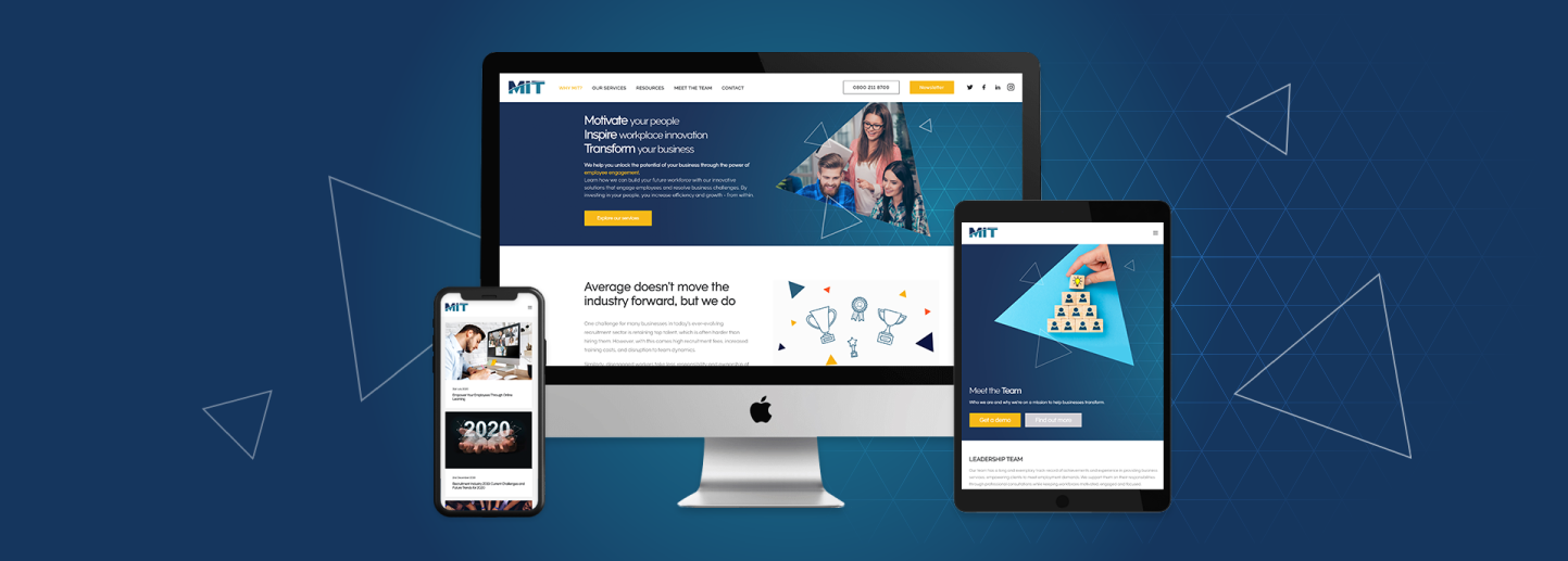
Working with the head of marketing for the UK, we started our process by critiquing the current website and gave our insight and suggestions for improvements.
At a glance, their website was just one long page that didn’t tell the viewer what the business did and left people feeling confused and non-infomed.
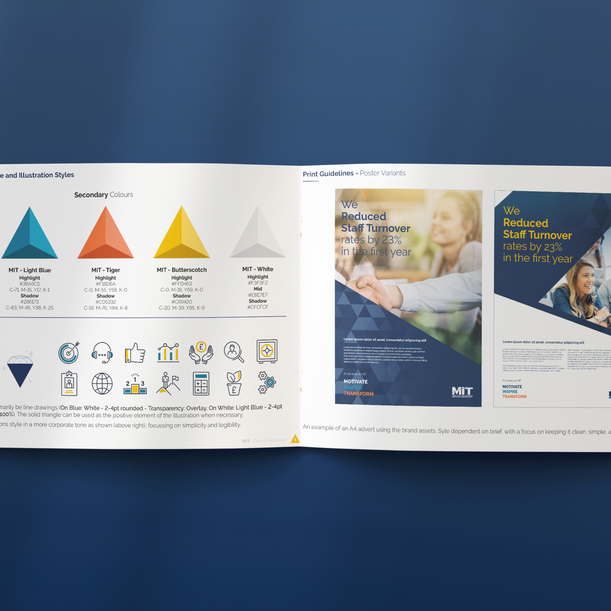
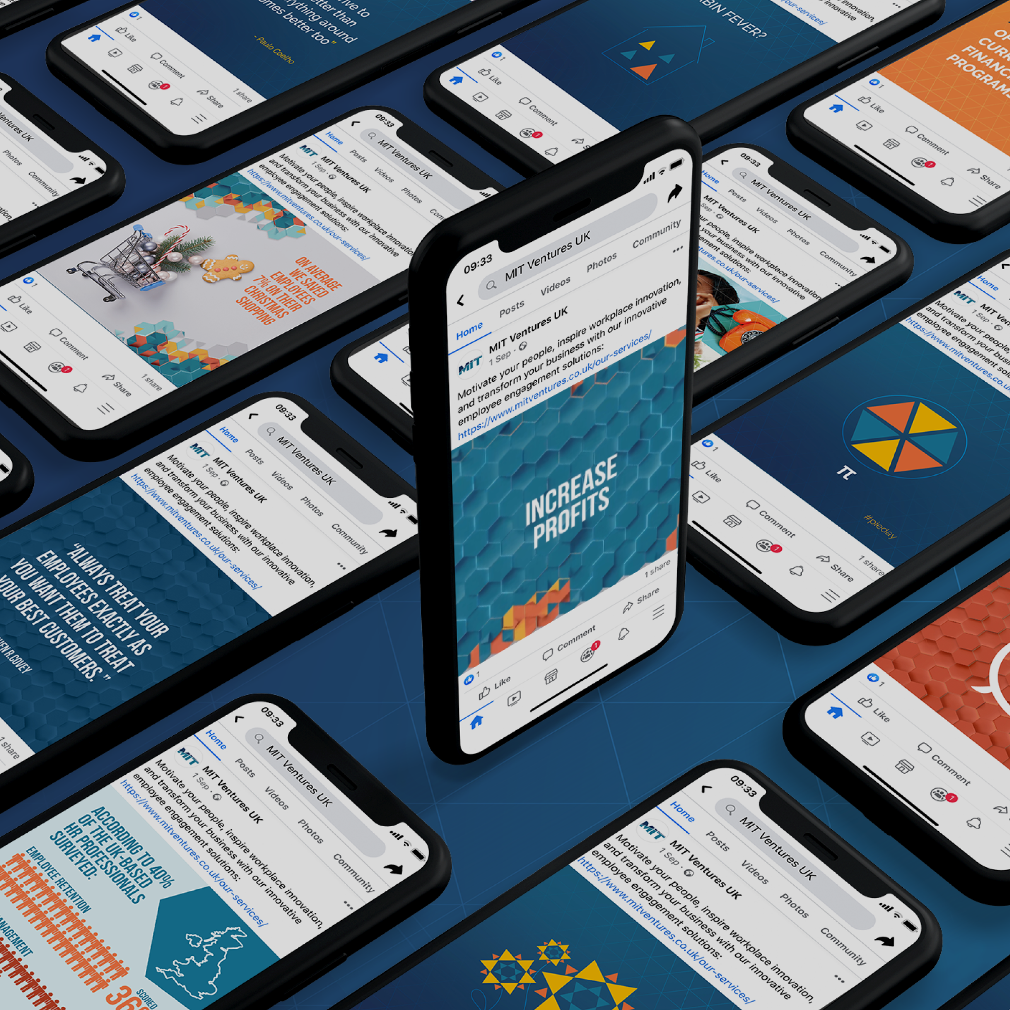
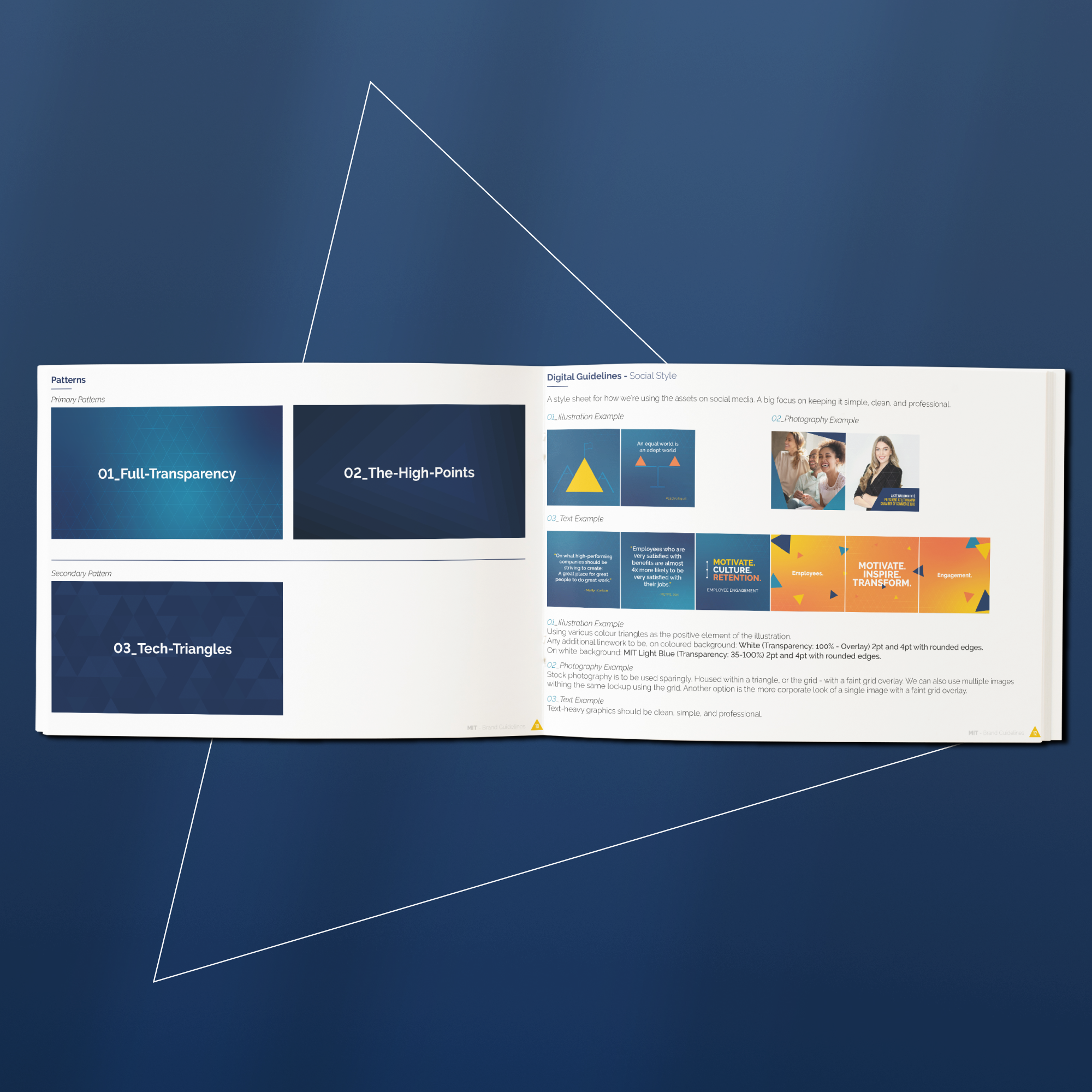
As a team we went back to the basics and took the very basics of their brand and developed so we had a whole array of assets, colour palettes and rules in place that we could start to roll across a variety of channels.
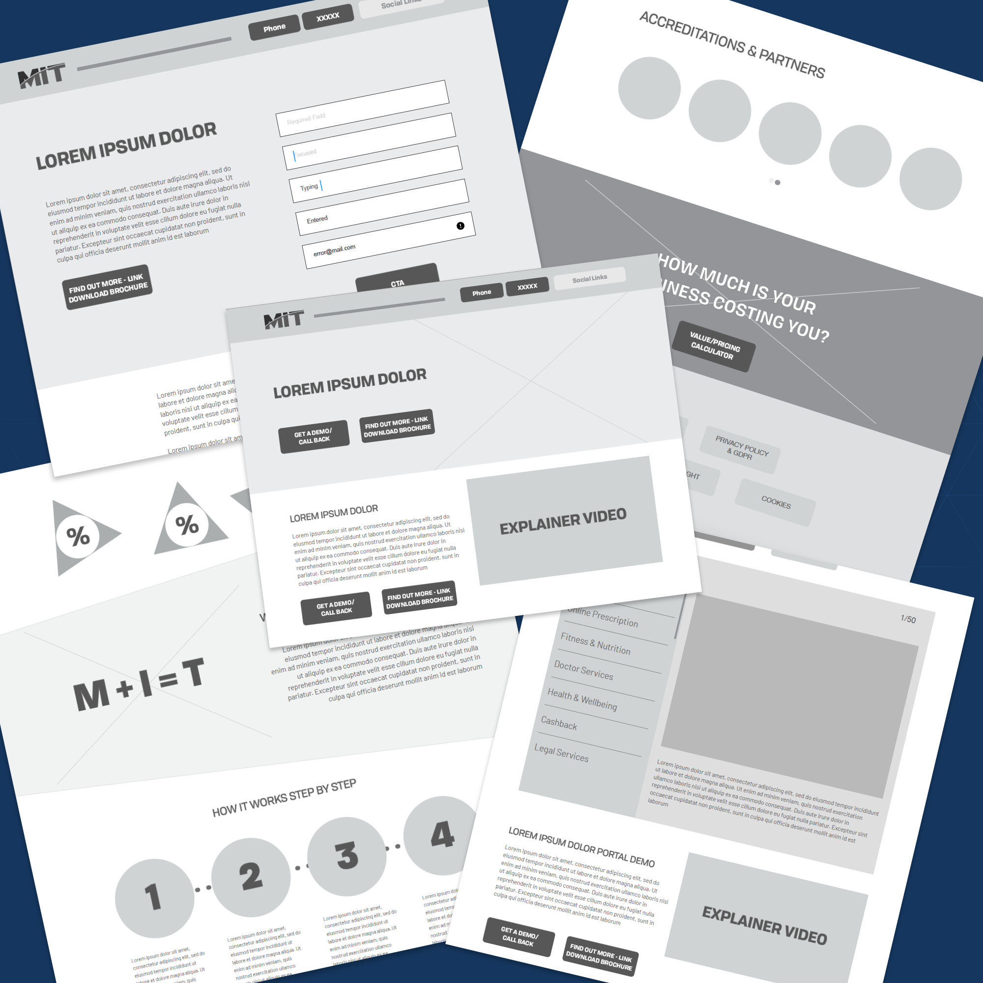
We worked through the clients ideals and what content they had or were able to get hold of as well as our suggestions for the best user journey and content, creating sitemaps, user journeys and wireframes, followed by final design layouts that were then passed to the development team for creating.
Some the functionalities of the website included a calculator that showed business owners the cost to themselves for not using MIT.
Changes to the content were made for SEO purposes with key terms and phrases which helps search engines to pick up the site for key word searches.
Results
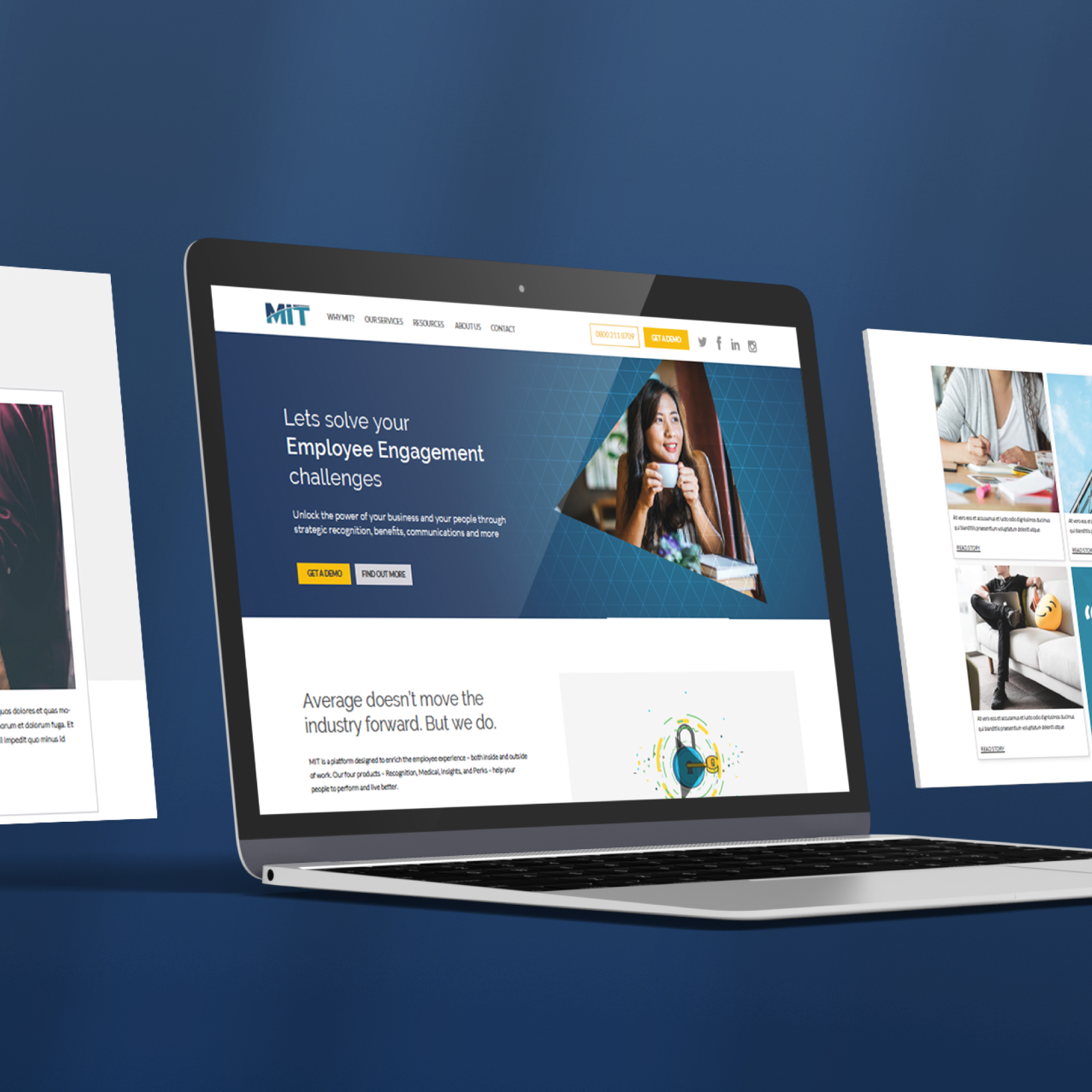
The MIT website now is more than just one long page. The site aids users to understand what the company does and easily navigate around to find resources and benefits of using them.
The site was broken into easily digestible chunks with engaging images rather than being stock heavy. The styling flowed across the whole site and we had extra features in a whole resources section.

