One of the UK’s largest weight loss brands was undergoing a period of change – a digital transformation. About Time was engaged as LighterLife’s lead creative partner to transform the brand identity, set a new direction for the positioning and digital strategy for exponential growth.
LighterLife has invested hugely in providing one of the most successful and unique weight loss programmes in the UK. Its portfolio of weight loss plans and extensive research is broader than most of its competitors and has the capability to reach a large audience.
Approach
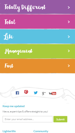
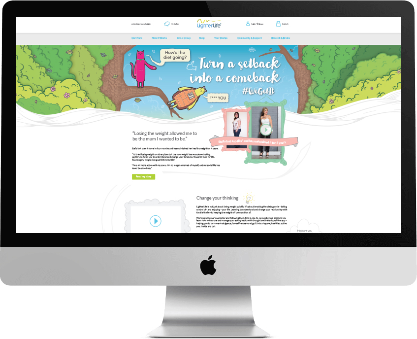
LighterLife connects with people of all ages and needed to be seen as personable brand. To bring it to life we suggested an extended and more vibrant colour palette that reflected a range of psychological emotions that clients could connect with. The idea was to translate these colours across a wider range of materials including diet plan identities and books.
LighterLife needed to be multichannel – the ability to interact with prospective and existing customers on a wide range of platforms around the clock. In particular, they needed to connect digitally. At the time, LighterLife only had a website and e-commerce shop where clients could purchase food packs related to their plan. We needed to create a more accessible site that worked alongside some of their current systems and one that was accessible by a wider audience and wider range of platforms.
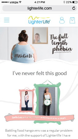
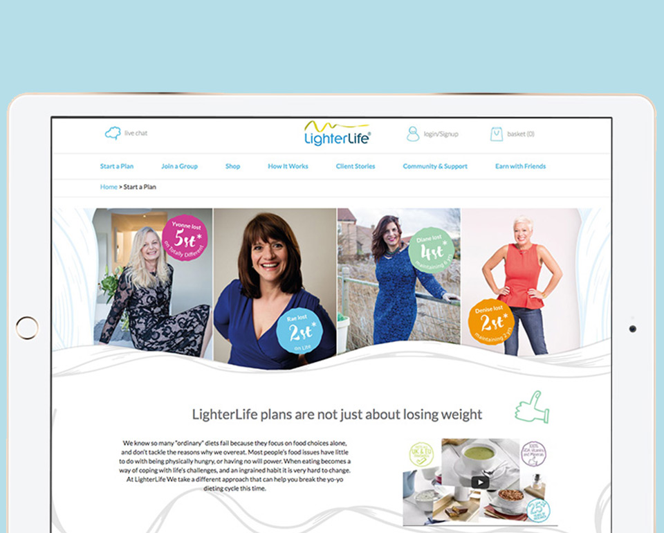
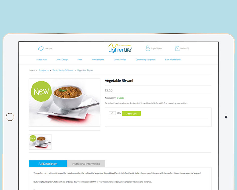
We built a bespoke, mobile responsive website the using WordPress CMS, integrated that with a Magento shop, their existing blog and internal CRM system. Custom themes had to be developed which allowed full customisation of the site by the client.
This was all tied together by a bespoke API developed in Laravel to allow all platforms to work together seamlessly, enabled the capture of more data and allow LighterLife a better understanding of their customers and also put in place the foundations for future developments such as apps and games.
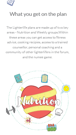
As part of the website rebuild, LighterLife wanted a complete redesign of the aesthetic and User Experience of the site. There was a big focus on navigation as the old experience proved frustrating for many. We created an illustrative style which allowed for fluid modules rather than a block template that the client wanted to stay clear of. The style injected personality into the brand which translated well onto social media. The design featured less clutter, lifestyle success stories for engagement and more prominent calls to action.
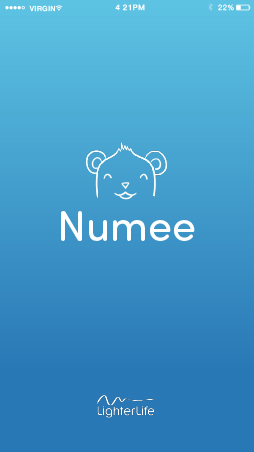
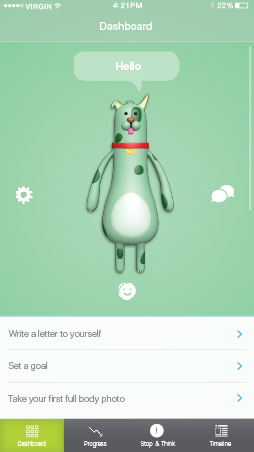
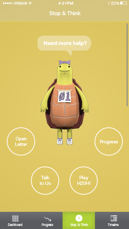
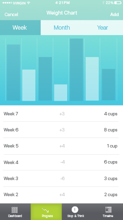
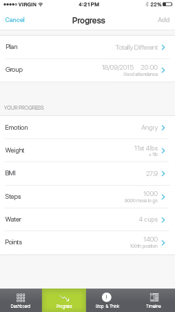
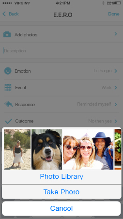
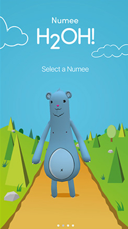
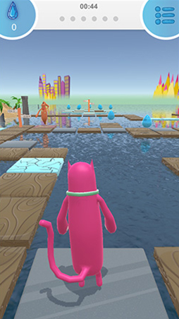
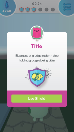
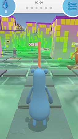
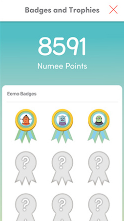
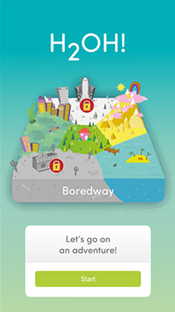
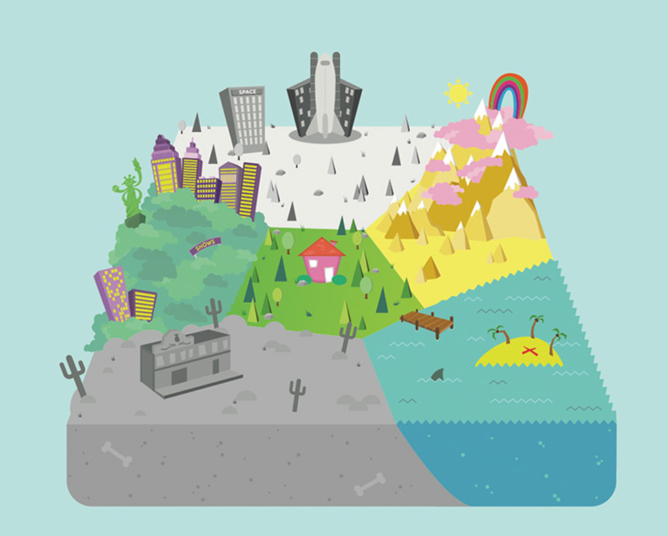
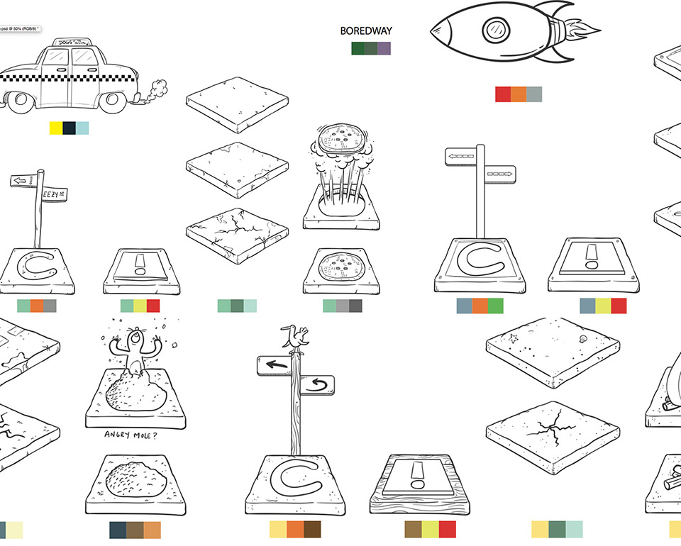
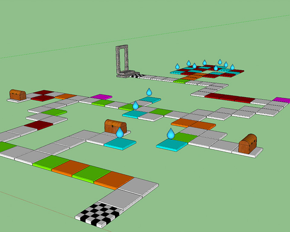
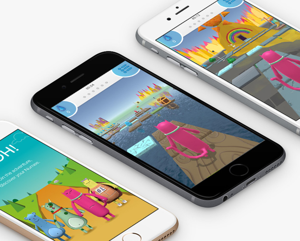
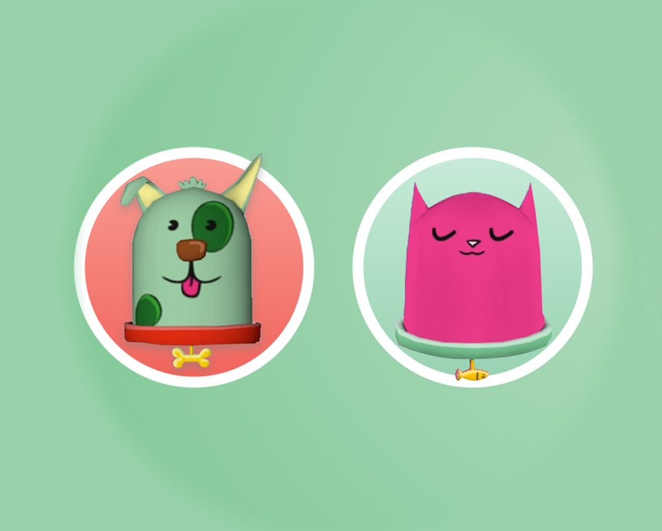
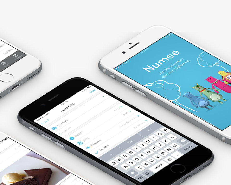
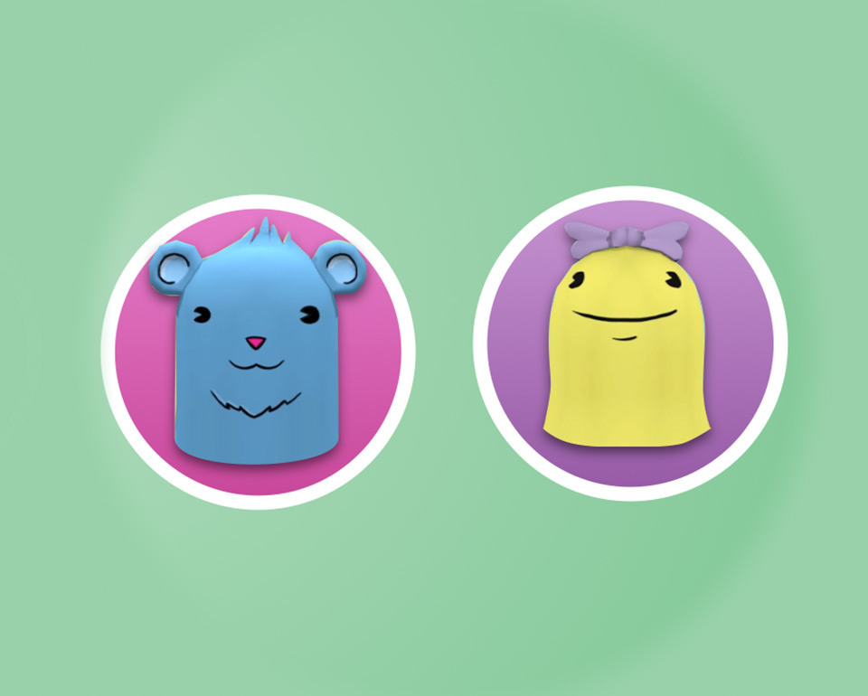
We consulted with the board which led to the decsion to build an app for consumers. This would be rolled out initially across LighterLife’s iOS users. Our work started off with a lot of research into the psychological relationships people have with food which led us to create a range of illustrations depicting emotions such as ‘bored zombie’ and characters which could help combat the ‘negative’ emotions called the ‘Numee’s. These characters would become animated within the app and game. We wanted an easily accessible and personal experience where the user would look after their ‘Numee’ and in turn, look after themselves, a port of call when they find themselves struggling in situations and a place they could journal their journey.
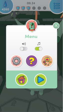
The apps design used native iOS patterns to not distract from the experience of the app, causing less confusion. It provides interactions they are used to on this platform. Aesthetically the app is personalised by the users choice of Numee character at the beginning of the journey with fun and bold colours, overlaid with a functional and prominent UI that can be used by all ages.
Results
A refreshed, less corporate feel that people can connect with on multiple devices. LighterLife’s investment in its new digital brand gives customers an easy to use customer experience which helps customers access information and convert with ease. To support the organisation at launch, we provided easy to apply guidelines for digital application and campaign messaging that enabled them to resonate with customers.


