The Project
Develop a brand logo/identity and website for La Montaña, the walking holiday experience in Ibiza.
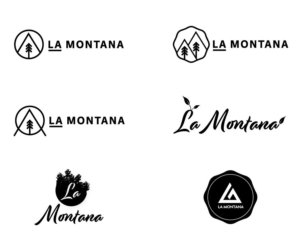
The client was looking for a logo that was clever, simple and modern whilst expressing hints about the unique location and its activities.
Capturing the remoteness and simplicity of the location was part of our challenge and also that this was a brand new venture, with a new name and up until now, there was no awareness that the business even existed. As we worked on this project, we were conscious that by perception, many people still tend to think of Ibiza as simply a destination for clubbing. Part of our brief was to work closely with the client to create a site that would show a different side to Ibiza, appealing to nature lovers and those interested in outdoor pursuits.
However, the client wanted the site to be attractive to a wide variety of users, not just those looking for a walking holiday.
Our Solution
Logo/Identity
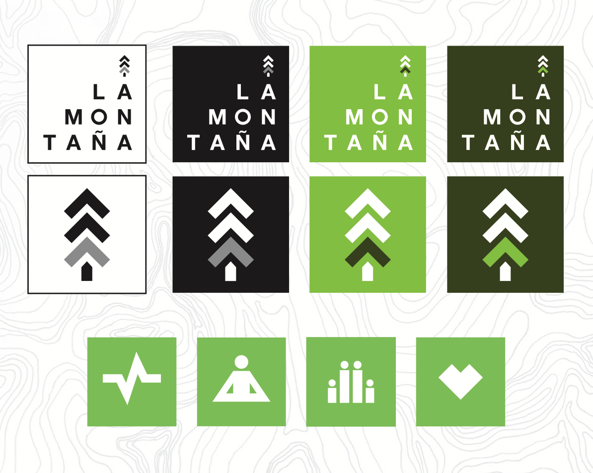
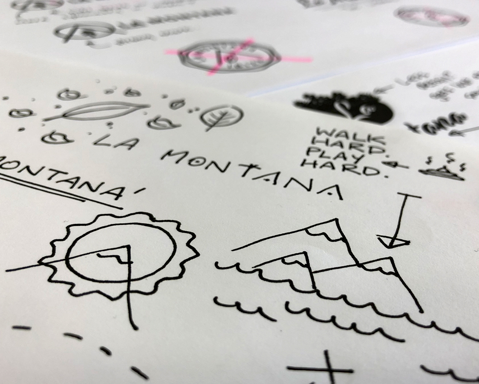
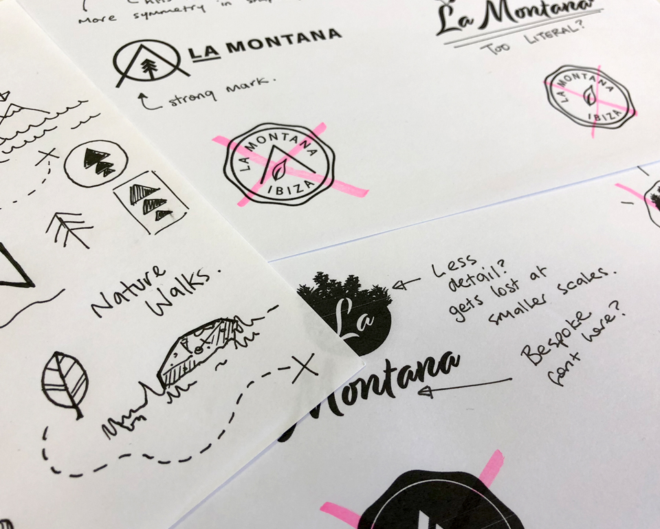
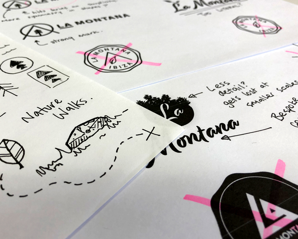
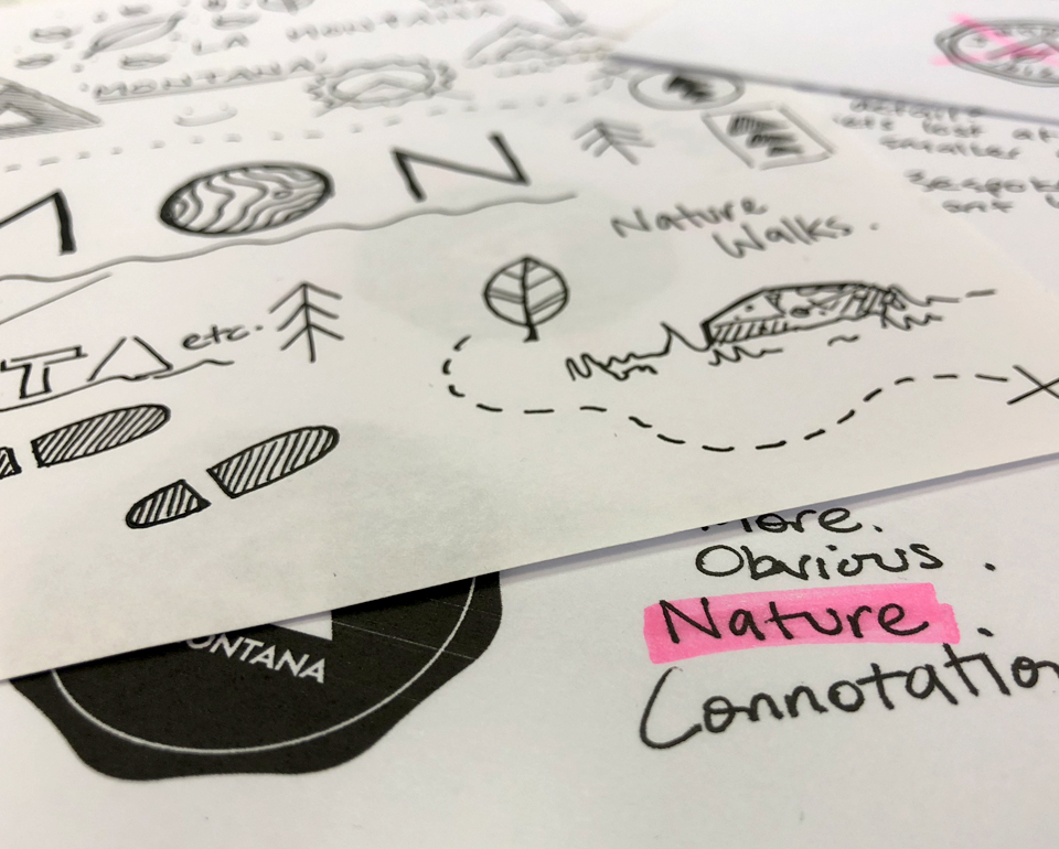
We designed a strong visual identity, drawing on the idea of the ‘Pine Islands’, (The Pityusic Islands) and the third highest mountain in the North of Ibiza, as inspirations. From those characteristics, we created a strong iconic brand which can be interpreted in many ways;
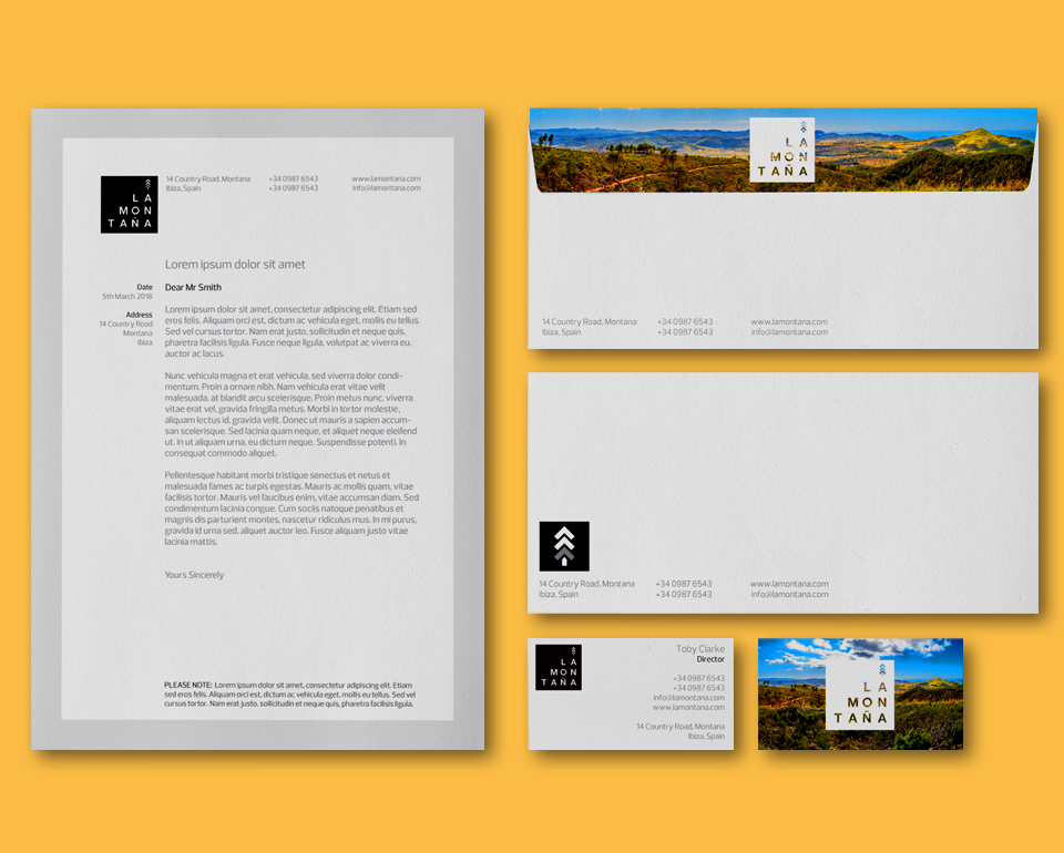
Pine Tree – Represents the history of the island and the experience/scenery of La Montaña
Pine Tree Branches – The three branches represent the 3 highest peaks of Ibiza, the third highlighted to represent La Montaña
Logo Type – La Montaña is stacked, like stairs, to represent climbing to the peak, 3 steps = 3rd highest peak, pine tree on top
Simple strong square – The square is simple and clean to help represent both the simplicity of the La Montaña experience and the casita.
For the colour palette we recommended several options to the client, all based around the greens and browns of trees/nature but with contemporary twists to offer options for a memorable, bold and modern logo.
Website design and build
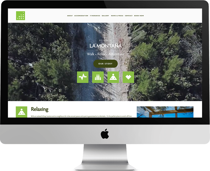
The site was simplistic with modular blocks, allowing content to be easily changed and refreshed by us or the client.
One of the key strengths of this place is the location itself. In order to fully capture and promote the breathtaking location in all of its glory and to make sure the customer appreciated the remoteness of the site, we recommended to incorporate high quality photography and drone footage flying over La Montaña’. We wanted the location to ‘speak for itself’ and at the same time apply the branding and colour palette subtly to build the identity but keep the site as natural looking as possible.
Icons – In order to appeal to a wide variety of guests and to help give the site some unique character, we created some fun, stripped back icons for four different groups or ‘types of stay’ that we helped the client to identify. These were ‘Active’, ‘Relaxing’, ‘Romantic’ and ‘Family’ and were designed to be in keeping with the main logos block style.
Although La Montana itself is a new venture – the client is a high profile person on Ibiza and already runs the very successful businesses ‘Walking Ibiza’ and ‘Ibiza Food Tours’. In addition to the About sections, we also used a press gallery to showcase the clients profile and tell his story. Links to his other business websites were added and we also pulled the social media feed from Walking Ibiza into the site to make the clear connection and ensure regular fresh, related content was incorporated whilst the casita got up and running to develop its own.
Results
A strong brand identity featuring a bold, memorable icon and complimentary colour palette that references Ibiza and nature while emanating a contemporary style.
A unique and visually attractive website that transports the guest to the location and tells the story of La Montana and Walking Ibiza, clearly showing Ibiza as a perfect location for walking and outdoor pursuits.


